

Web Portal - Customer Dashboard
Redesigning a customer portal that holds key functionality for content management, deployment and analytics
My role
Design manager and UX designer
Team
1 user researcher, 2 product designers, 1 product manager, 1 CG manager, 4 engineers
Context
A customer portal that manages VR content, hardware (headsets) and training analytics/insights for all learners


User and Stakeholder Research
After conducting intensive research, including customer interviews, stakeholder discussions and more, I identified the biggest challenge for the design team.
The portal is a very technical, complex tool that provides a lot of functionality, such as provisioning headsets, assigning them to various customer locations, managing content and deploying it to headsets, collecting the telemetry from training sessions and presenting it as data viz, among other things.
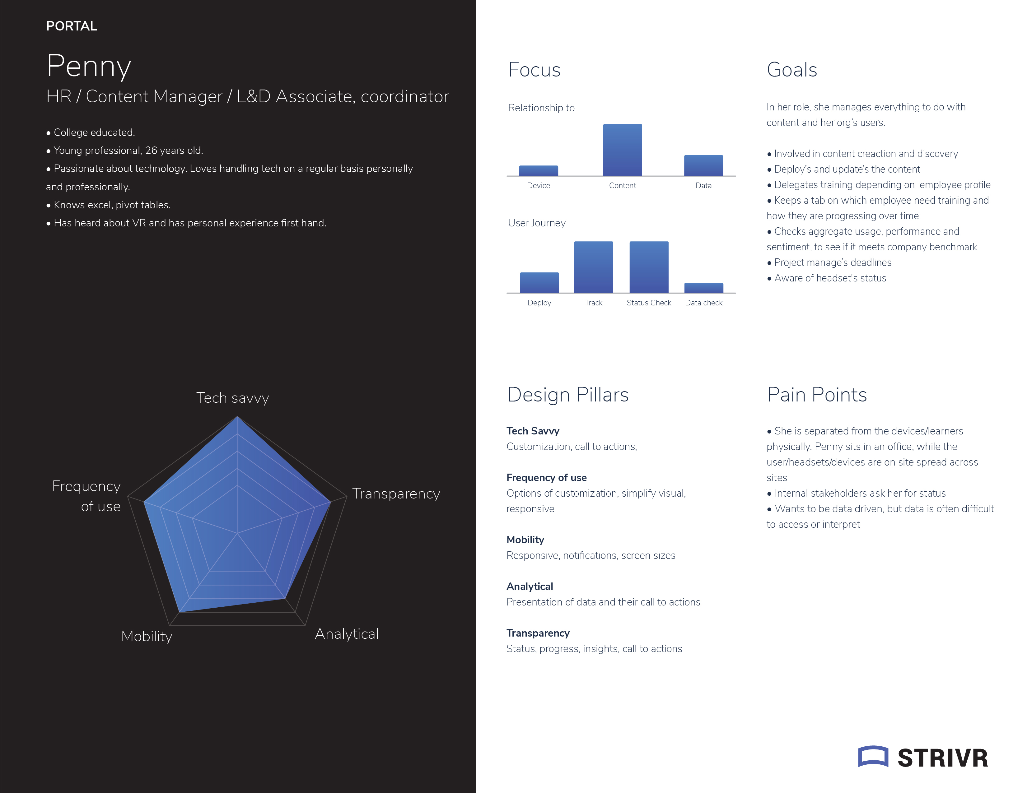
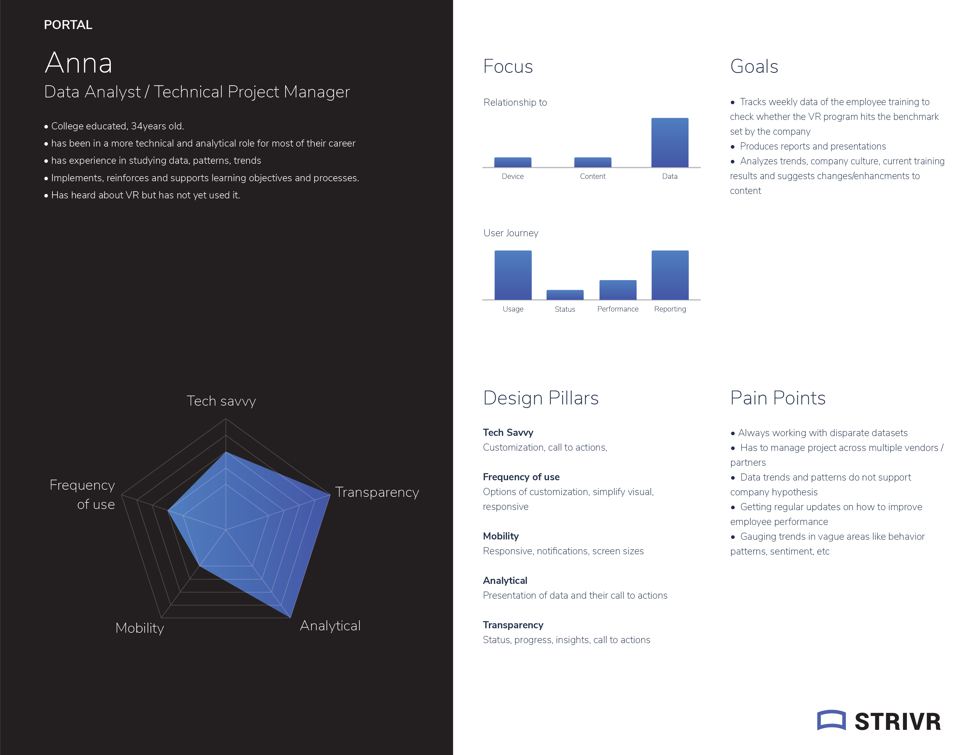
We had two personas: One technical persona (Customer IT manager or Data analyst) and a non-technical persona (Decision maker that would see the value VR brings to their company)
The technical discrepancy between these two personas was the main challenge we needed to solve on the design side
Design Strategy
We decided to approach this challenge in three key parts:
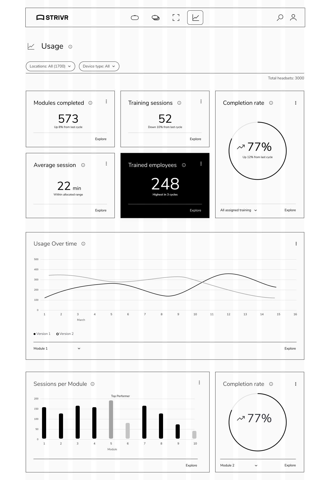
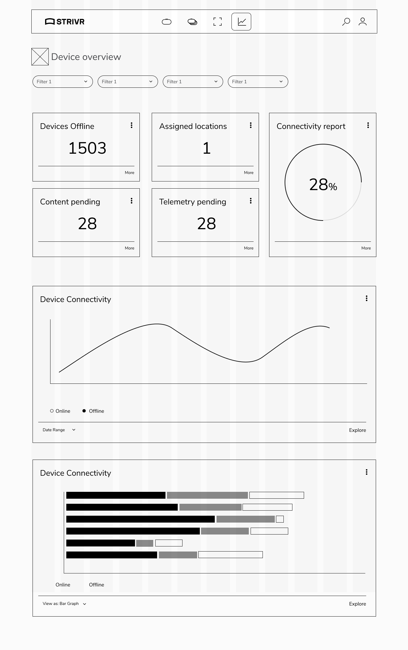
1. Simplify the IA: Sort all functionality into four easy-to-understand, non-technical buckets, so that any functionality users are seeking can be found as easily as possible.
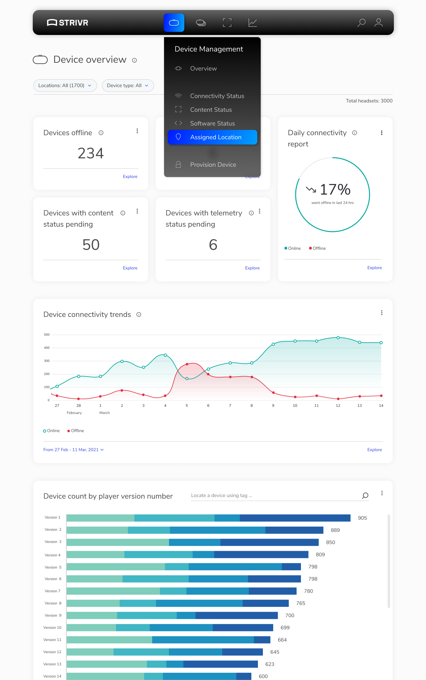
Device: Where users can manage VR headsets, from provisioning them, to updating their software, to editing the content that is on them
Fleet: Where users can manage Groups of VR headsets assigned to locations, and batch manage them
Content: Where users can upload, manage, and deploy content to headsets
Analytics: Where users can view data coming in from all their training sessions
2. Add a layer of insights / actionable items in a human-centric way.
For instance, we replaced technical language like "Available space: 25MB" with more user-friendly messages, such as "Not enough space on headset for new content," or converted "x number of MAUs" into actionable insights like "10% uptick in usability from last month."
3. Leverage a card approach when presenting information to the users. This will enable users to rearrange the cards on the page in a way that makes sense to them, and add commonly used cards to their dashboard for quick access.
For example, The non-technical persona can add cards that hold completed sessions per month to track their employees' training, and key skills gained from a specific training module. The technical persona can add a connectivity card to keep an eye on any headsets that have been offline for a while, and a card that holds Content that is pending deployment to headsets at a certain location.
Wireframes and concept testing
Now that we had a design strategy that will simplify using the portal, it was time to create the interaction model that will make it come to life. We did a few iterations of layouts, prototyped them and tested them out with internal users and select customers and landed on the design paradigm below. A few key points:
1. We chose top navigation because we knew it could hold all content / future content without issues. Also, it gave us more room for the content of the page
2. We added a Summary section on all pages that gave an "at a glance" view of the page. For more details, users would scroll down and get as deep as the needed to.
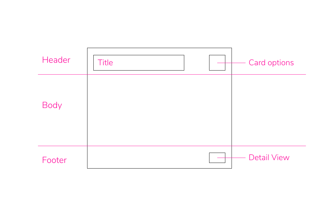
3. All cards have a Kebab menu where they can access things like hide, move, pin to dashboard functionality.
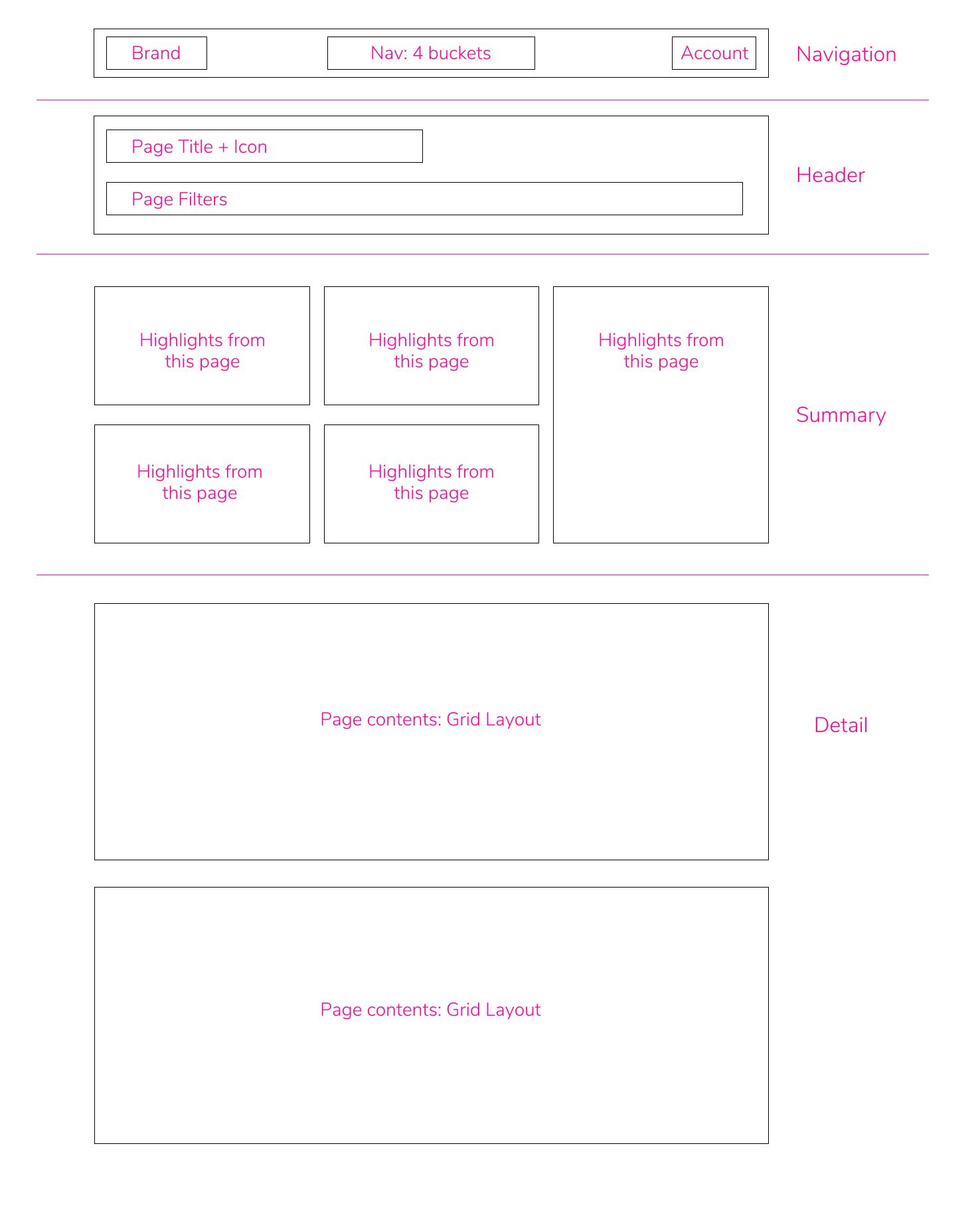
With that structure defined, it was time to get into the weeds of all pages and content and create mid and high fidelity wireframes. Due to privacy, I will only show two pages, but they all follow the same design pattern
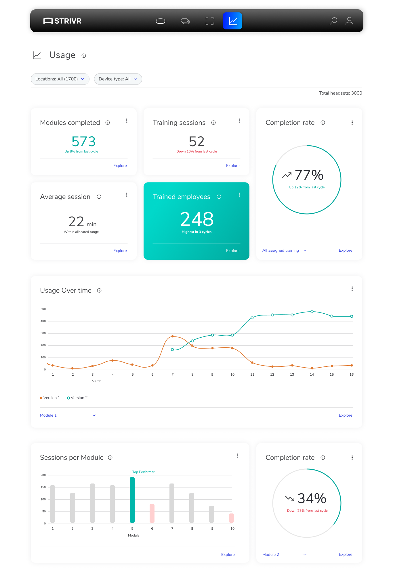
Visual Design
With all the information packed into the portal, we knew it was a challenge to avoid visual clutter.
My direction to the team was this:
1. Light, almost faded feel for the overall tone, except navigation which needed to stand out more
2. Negative space is more important than minimal scrolling
3. Simple, light colors for all UI
4. Rounded edges on cards
Below is the final result. Again, I cannot show more than a couple of images here, but the rest of the portal follows the same design paradigm
Results
After launching the portal, we conducted focused usability testing with internal users and customers. The main metric we wanted to measure is how easily users could find what they are looking for. So we asked them to go through the site to test our task flows one last time. Users were able to achieve their tasks, and once they learned about the dashboard and the ability to add any card to it for quick access, we essentially reduced most of these task flows to a couple of clicks.
Customers also appreciated the insights layer, where they were guided on how to process the data. Also, they found the visual design easy to absorb, and not overwhelming, which was our goal.
Learnings and improvements
I was very happy with the results of this project. The teams collaborated well based on my design vision. It was messaged well and I got the alignment I needed to take on such a big effort. The design was successful judging by the feedback and testing sessions we ran, and overall it was a success.
As with any startup, there are time and resource limitations. Had we gotten a little extra of both, here are some things I think we could've done to improve the existing portal
My key contributions
As a design leader, it is crucial to make sure you give clear design strategy to the team, and give them the space and agency to execute. To do that, I had to evangelize the vision I had for the portal, with all the reasoning behind my decisions. I made sure I had alignment with engineering, product, marketing, solutions and customer success teams before I presented the vision to the leadership team.
During execution, I buy time for the design team by handing off core functionality we knew we needed to engineering, such as card sorting and navigation interaction. Once those pieces were in place, it was about maintaining velocity in handing off quality artifacts to engineering to ensure smooth implementation and launch.